I was responsible for the UX/UI Design for this project, working in a small team and collaborating constantly on ideas and design feedback with the rest of the product team.
Reece (Product owner)
Luca Guglielmi (Designer)
Davide (Developer)
Diana (Developer)
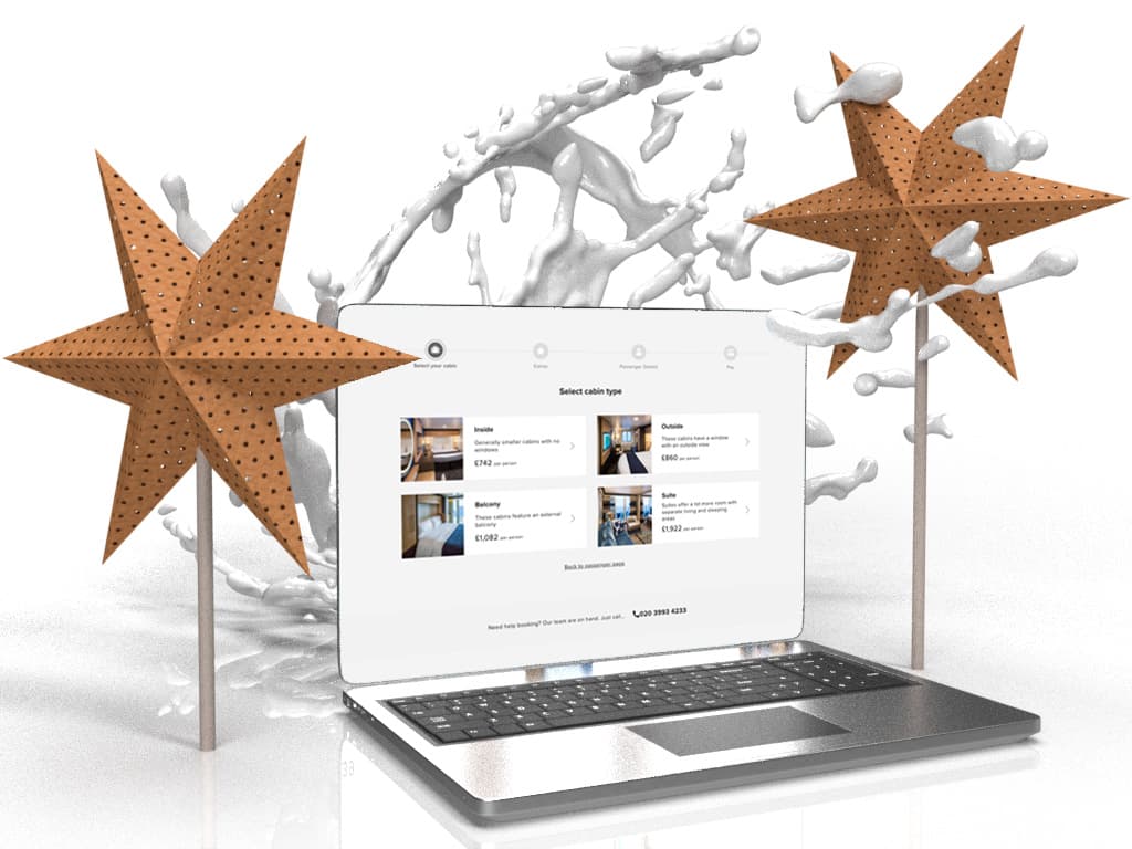
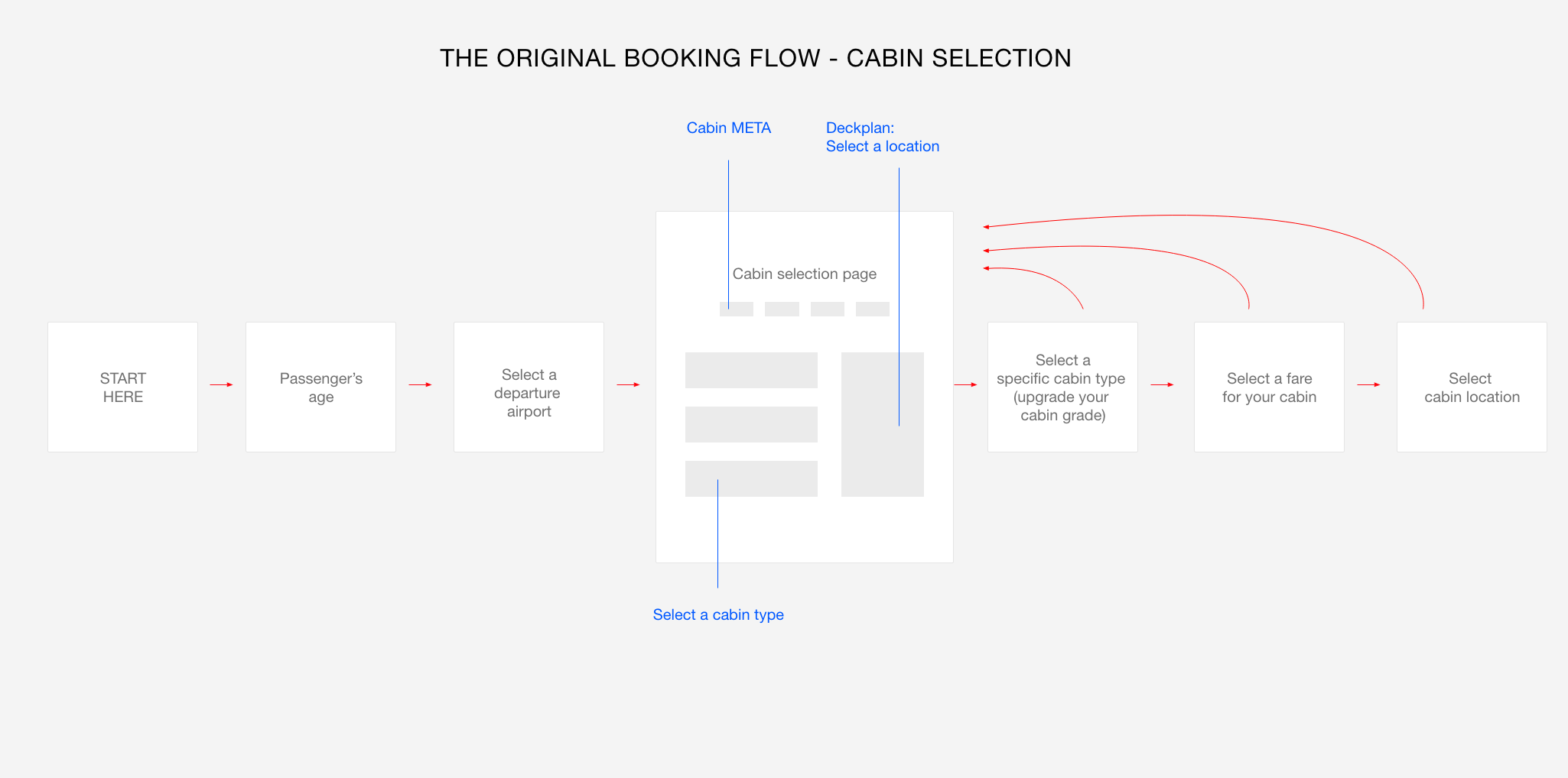
At this point of the booking flow, the user has selected a cruise and is now prompted with many options that will define the final price.
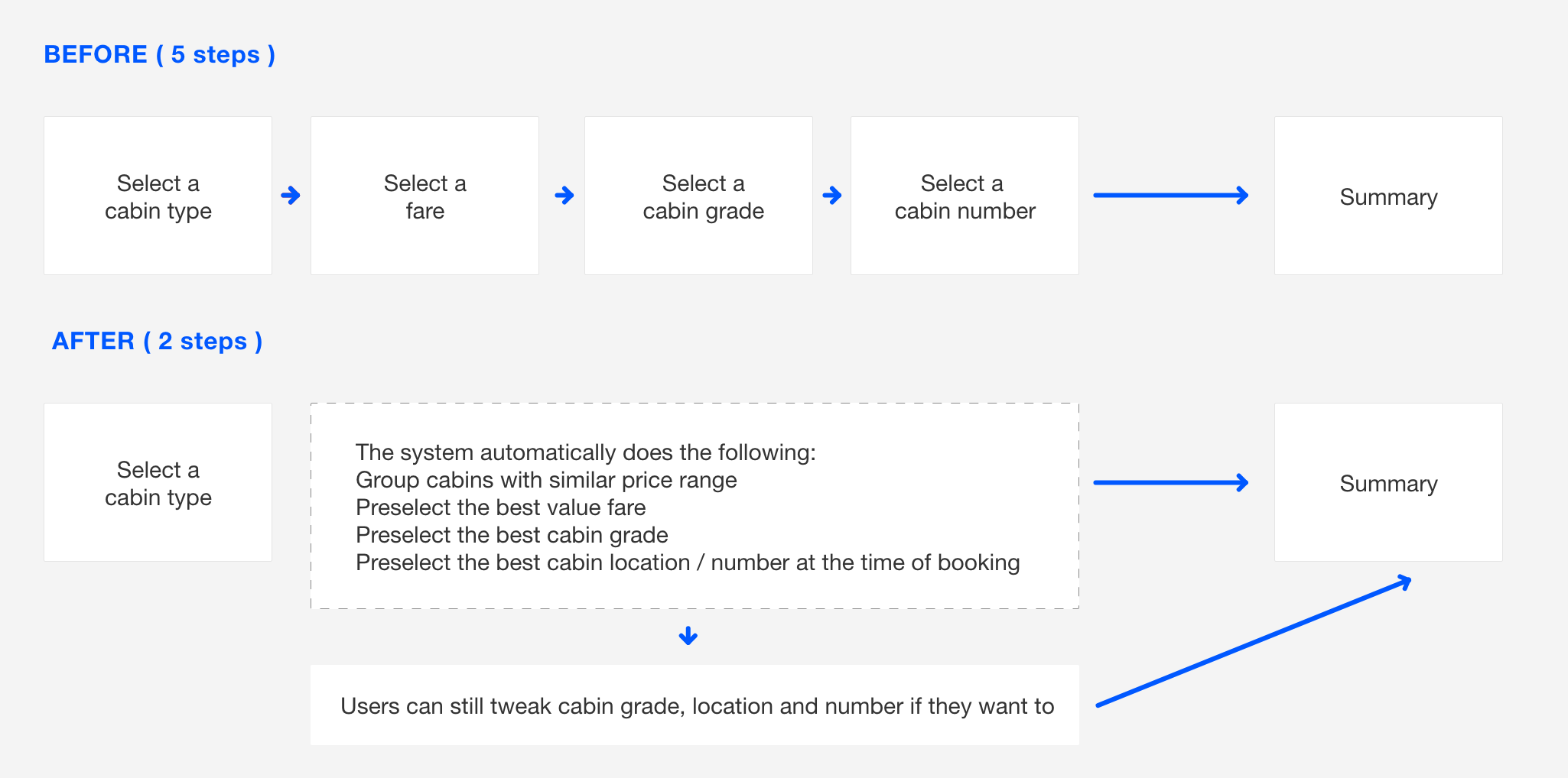
There are 5 elements the user has to decide on, in order to book a cruise.
The decision could be implicit or explicit, but these elements are strictly related to each other and changing one may affect the others in unexpected ways for the user.
The customer is facing a series of very difficult decisions before she can book a cruise.
The pricing system of the whole cruise sector is meant to be 'navigated' (no pun intended) by an expert travel agent, that would guide the customer through each decision and of course get a commission on the sale.
As a result, the user's confidence in booking a cruise online is quite low as each decision raises questions that do not always have a straightforward answer.
The product team as a whole wanted to use the research budget allocated for this project to learn more about high level goals of our customers, and maybe even find new opportunities for the business to serve them better.
The product was working well for a specific kind of user, but there was a lot of complexity and friction involved. We began looking at the available data to get a picture of the current situation:
Understand how all the pieces fit together: I started the project by clearly structuring the available information and seeing how each piece of data relates to each other. I was new to the cruise sector and while I was mapping the information architecture I came across many insights that would help me with the UX and UI process.
I began by reading every bit of information I could find about cruises: from current news to traveler's forums to research and academic papers. I have read public reviews of multiple cruise lines, watched videos of cruise experts but also cruise holiday videos on youtube. I have scouted reddit and other forums to see what people were asking about cruises, and then I researched the questions myself trying to make sense of it all.
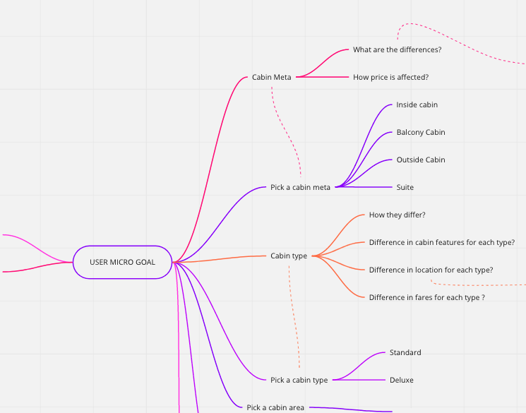
The next step is to group data together and associate it to direct user goals.
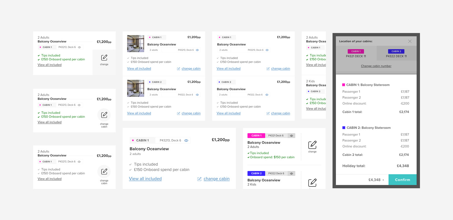
While mapping our existing data, we have found out that sometimes the user is presented with too many similar choice. In a specific case we were listing more than 20 cabins, with the same price and only some subtle difference in location.
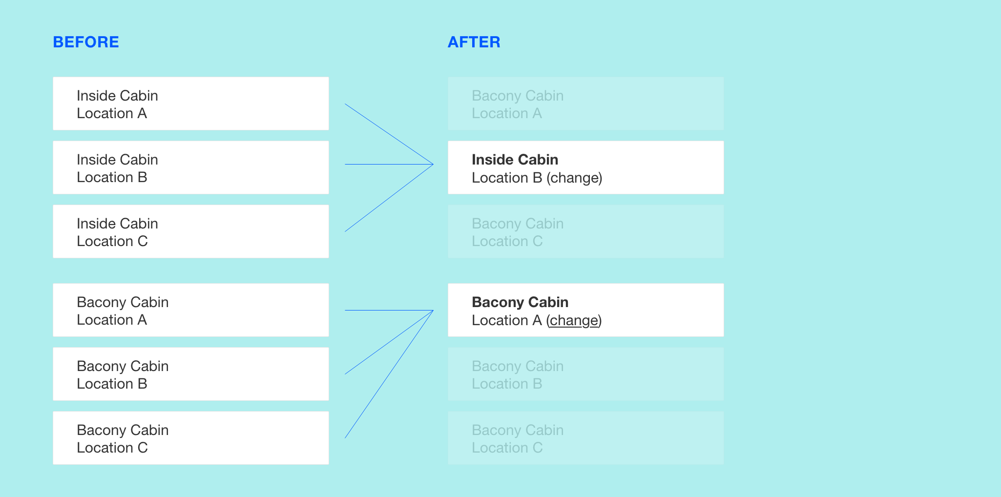
After verifying that this was actually confusing our customers through user testing, we removed many cabins from the initial listing and shown them only when the user intention was to view / change the cabin location. This increased conversions for some specific cruise line, and lead to a faster decision making and higher user confidence in the booking.
Watching session recordings was very helpful to find out how user interact with the current data, but it was hard for the team to make educated guesses on why they were performing certain actions. We decided to learn a little bit more about them, by combining user interviews and user testing.
We conducted 2 user interview sessions with 5 different customers each, in order to get a better understanding of the user experience in the booking process.
The first batch was with UK customers while the second one was with Italian speaking customers.
The italian website was performing poorly at the time and we thought it could be useful to compare the UK and international audience.
We began all sessions with a few warm-up questions to learn how the user thinks, their shopping behaviours and motivations when booking a holiday. Asking them to describe their past experience in this phase (either with us or with a competitor) is always a good way to find out important insights.
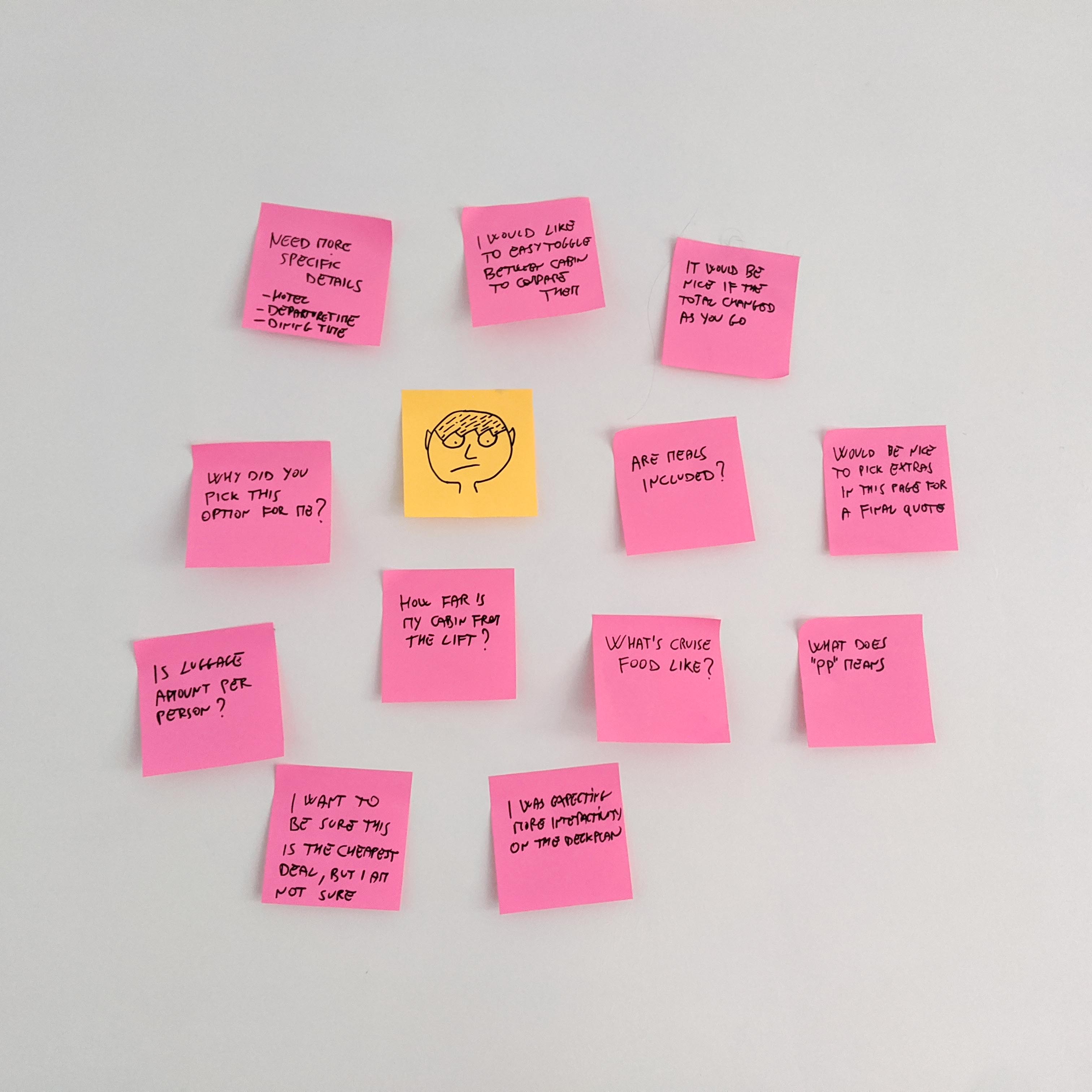
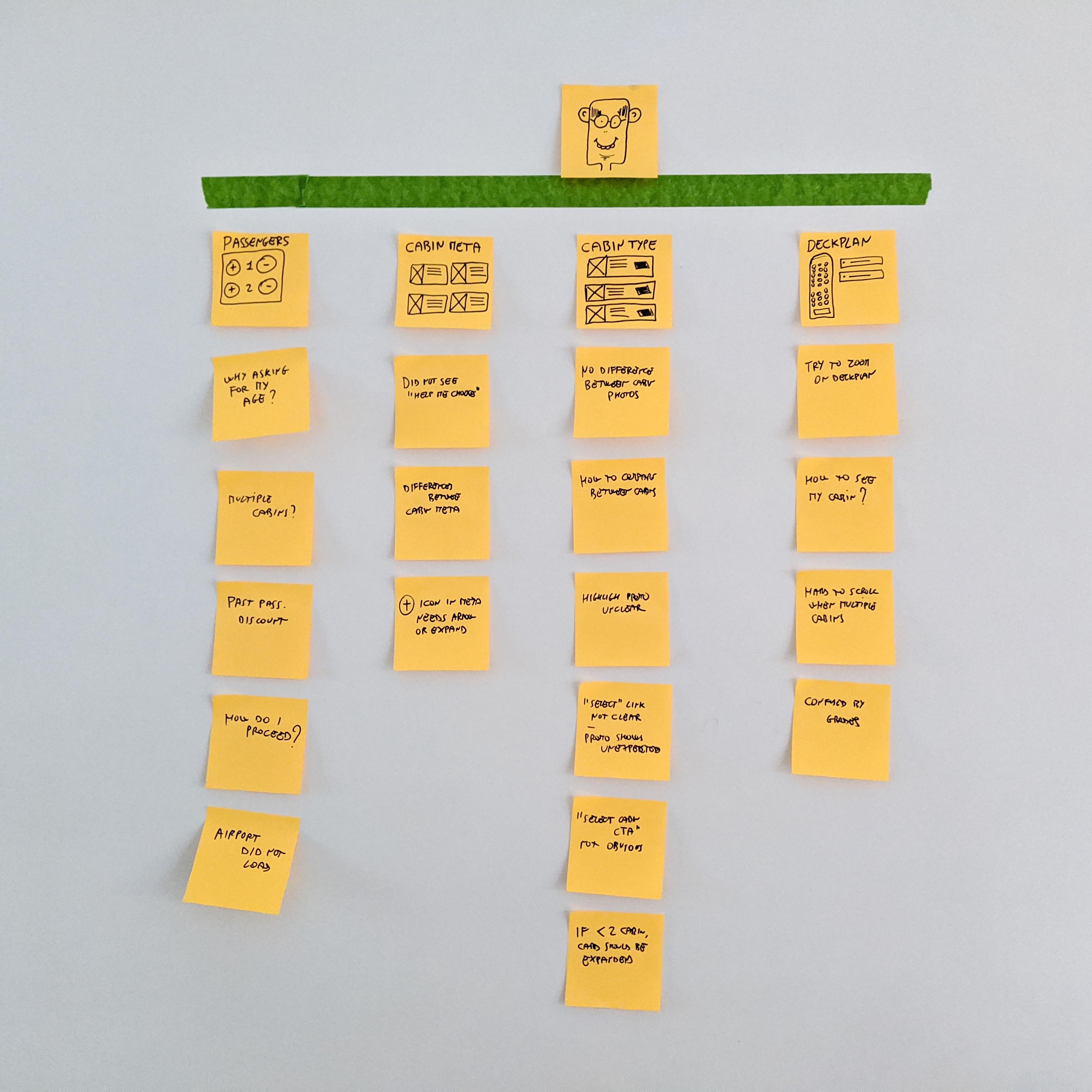
We ask customers to perform various tasks and see how they approach the online booking of a cabin. We asked the user to think out loud and came up with follow-up activities and questions for her at the end of each task. We noticed a considerable amount of friction in this phase, amongst all participants. Even excluding all the UI bugs / inconsistencies we had a long list of findings. Before we took any action, we went through 3 separate phases to get the best from the insights: 1) Problem definition and opportunities 2) Separate short term solutions from strategic ones.
Immediately after the user interviews session we had a small workshop to analyse the findings and list them on a wall. We used it to prioritise the problems that would give the maximum benefit to conversions.
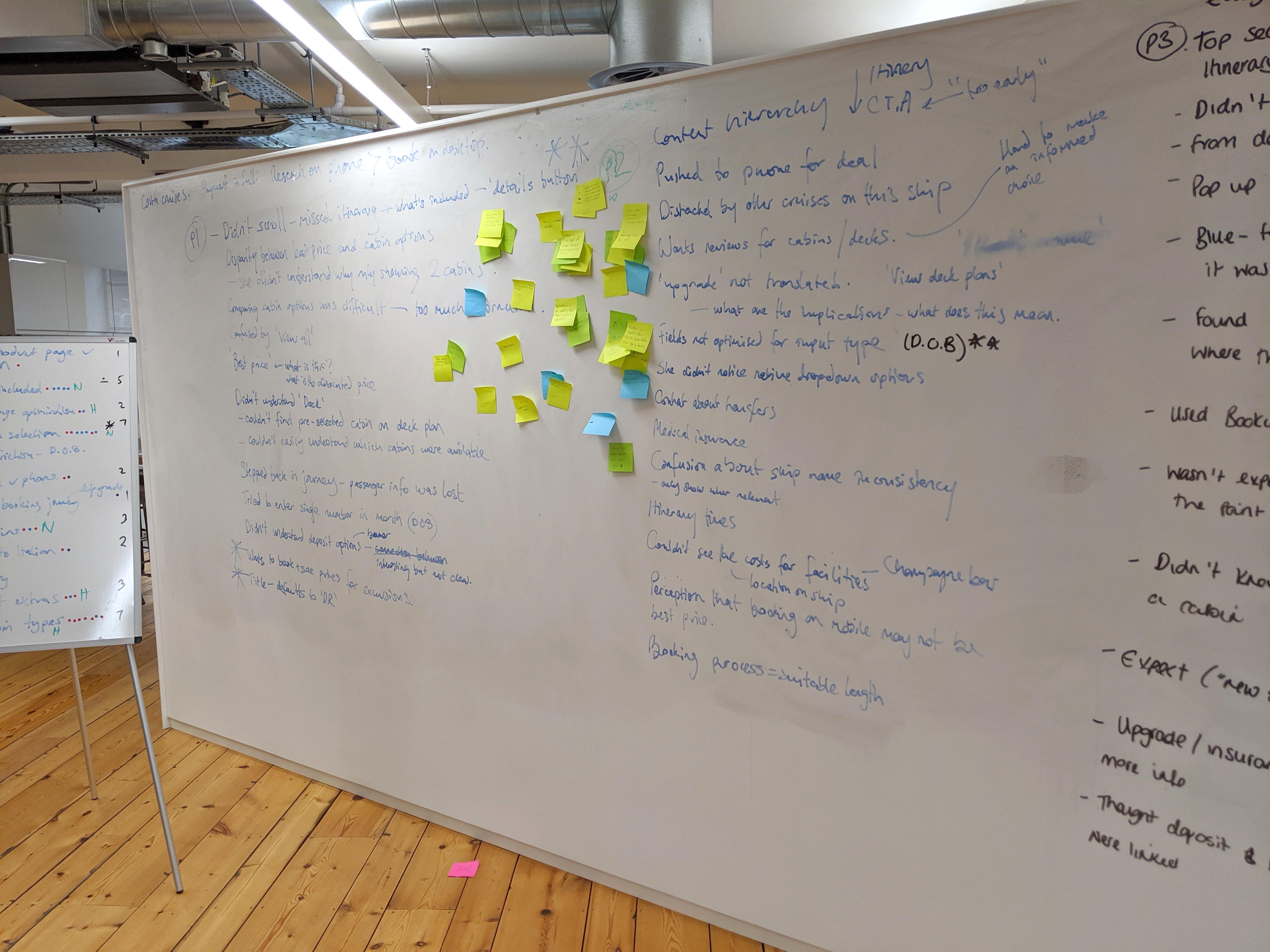
Later on, we split all the actionable insights into two groups: Short term vs strategic. Some of the problems / solutions touched multiple areas and required permission from different stakeholder like marketing, commercial, sales in order to happen.
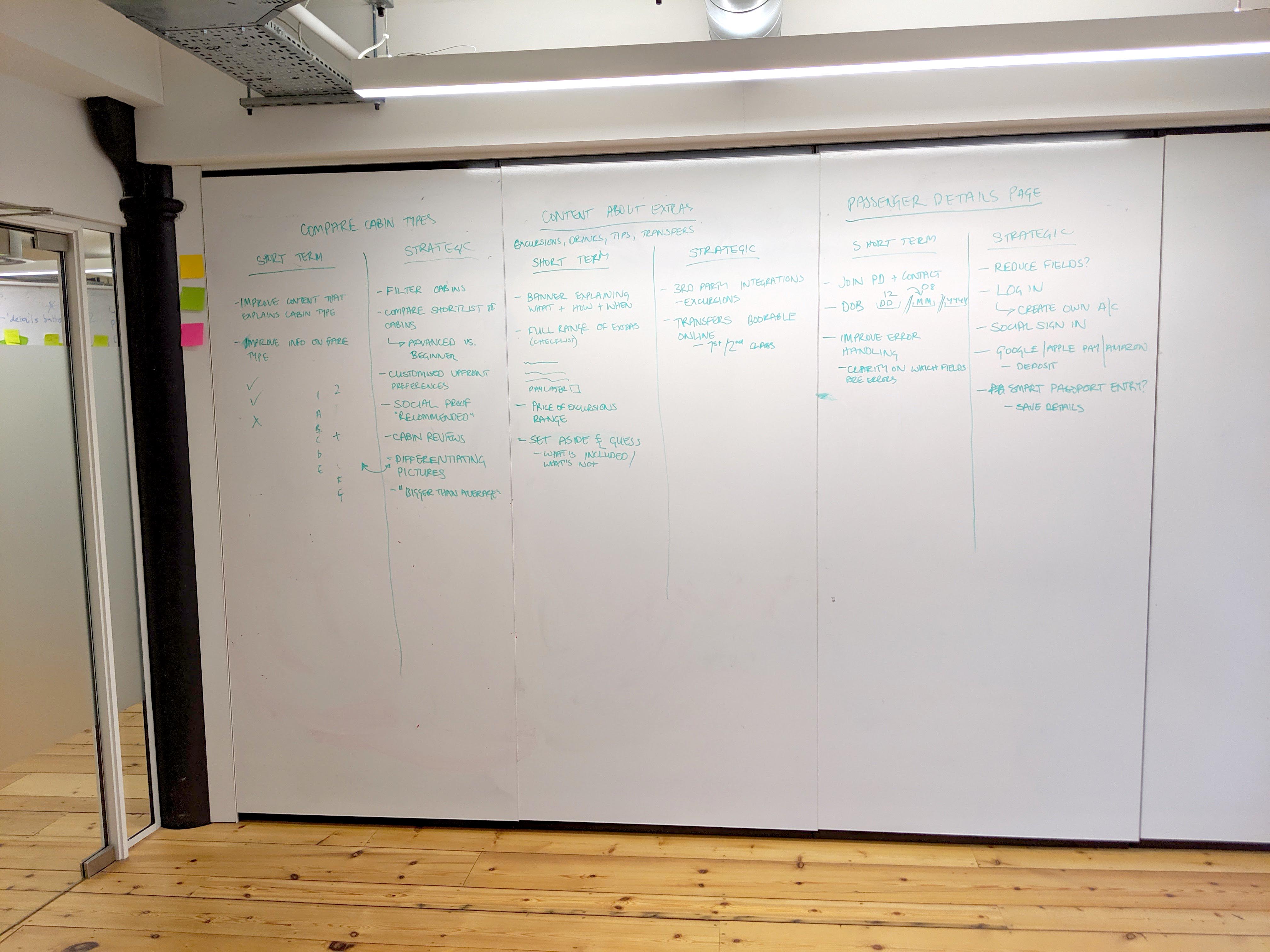
I summarised many of the findings using several customer journeys like this one. I like this method because it leaves the solution open, and focus more on framing problems and user goals. The 'idea' section was added to give voice to the possible solutions brainstormed during the meeting, but in no way they pollute the problem statement and the user goals.
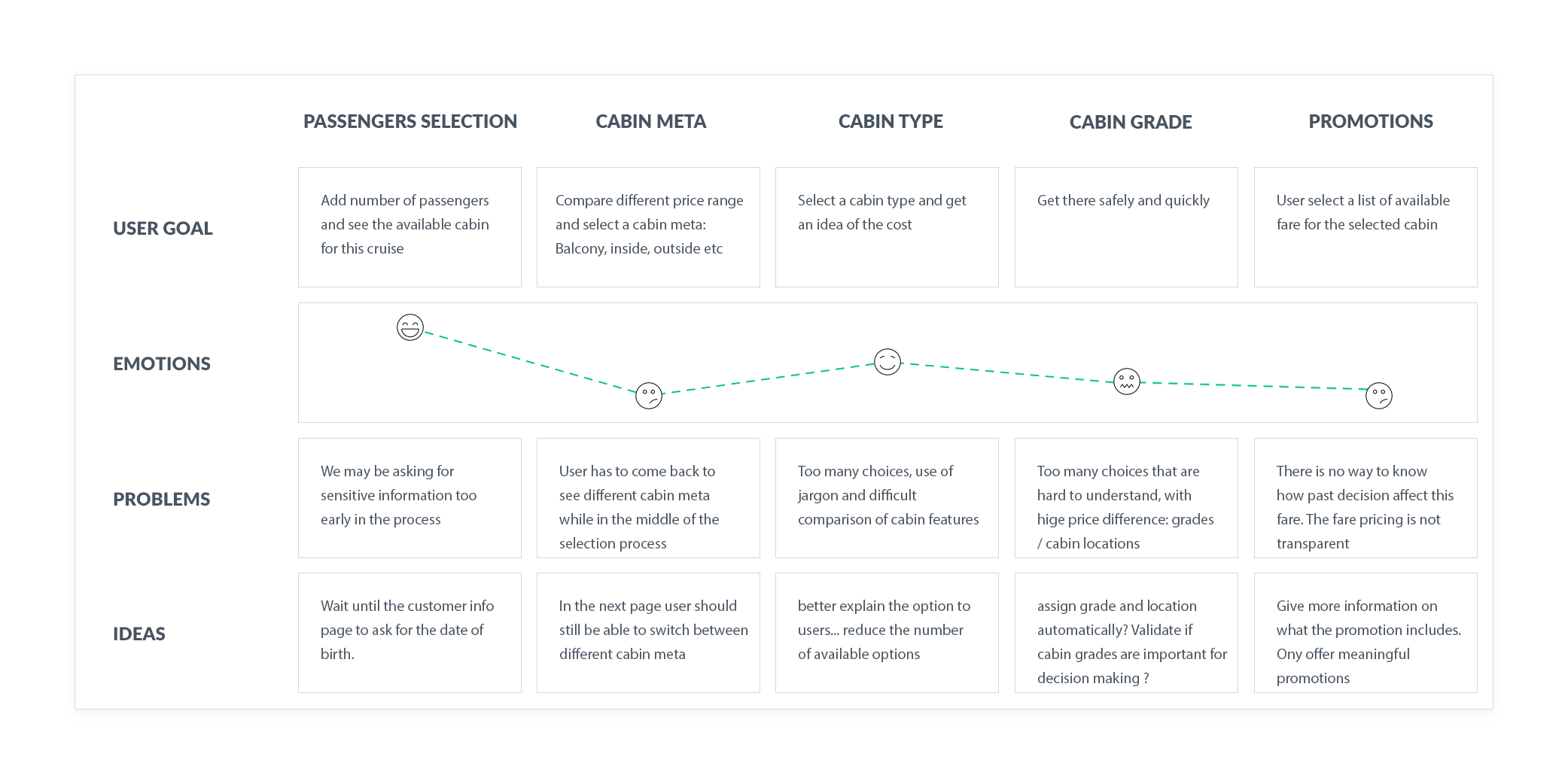
We have found multiple insights on how customer use the website, and once grouped together we have drawn a few conclusions:
The changes we wanted to test were mostly related to the user flow. To make them work we would need to change many aspects of the product, change the data and move some pages around, with a joint effort from different teams. We decided to implement small improvements, test the impact on a single micro-conversion within the page and then reiterate.
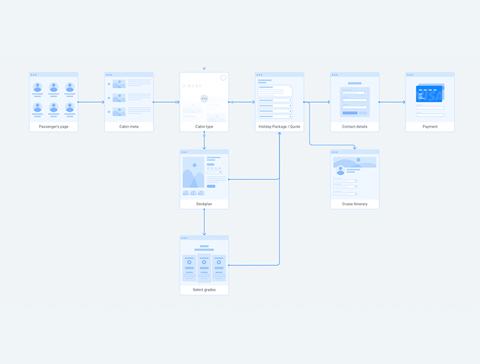
We developed a so-called "northern star" design, an initial concept with improvements that touches different aspects of both UX and UI. This was essential to align all the different teams towards the same direction.
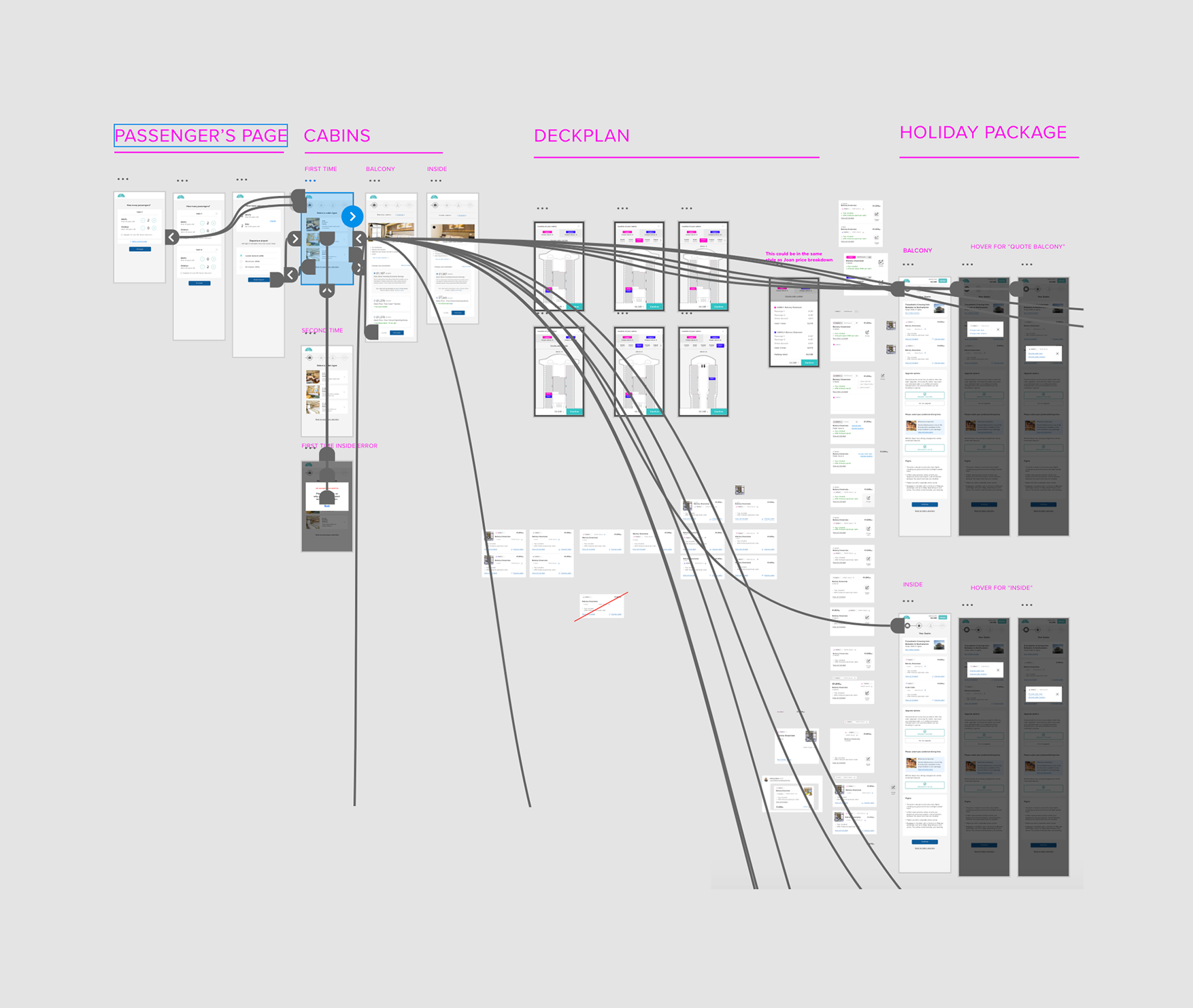
From this design we created a prototype to initially validate the changes in the user flow we all agreed on. After a few iterations of the prototype and 3 user testing sessions, we had a solution every team was onboard with, and that was working very well for our customers.
We could not develop the complete vision immediately in our website, so we focused on the core idea only:
we grouped together what was necessary for the changes in the user flow and ran an AB test against the current version.
Every other non essential detail was tested as a standalone feature, and in some case it took a few A/B test to get it right.
“Digital design is like painting, except the paint never dries." Neville Brody
Before I design pages - or even wireframes - I make sure I can work with a library of reusable components.
This is essential to quickly iterate between ideas and prototypes without redesigning everything from scratch.
Wireframes evolved into polished design at component level. The benefit of this approach is that halfway through the project I was able to illustrate a new idea just by dragging and dropping symbols and components in a new canvas.
Mobile users count for the majority of our hits in the website, but mobile conversions weren't as good as desktop ones. Historically we were designing for Desktop and the mobile version of the page was often an afterthought. With this project Iglu began adopting a mobile first approach and we never looked back.
We manage to simplify the user experience by moving from 7 to 3 pages in the cabin selection areas.We achieved that by proactively taking decisions for our users and then allowing them to change them later on. This halved the time needed for a user to select their cabin, without removing any current functionality from the system.
Below a list of some of the problems we identified through research, and the solution I have adopted in my design to address those problems.
problem number 1
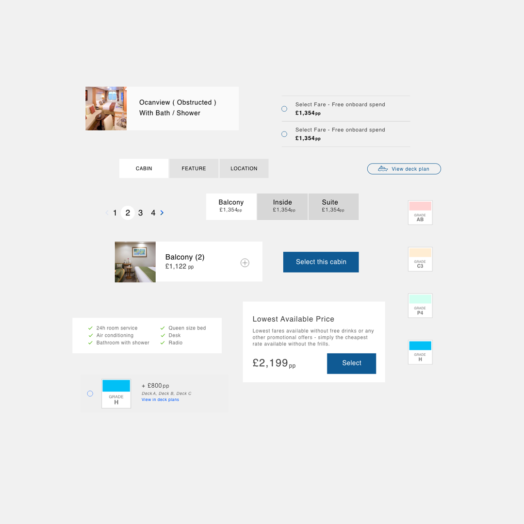
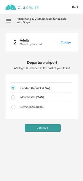
In case you are not familiar with Cruise jargon, "cabin grade" is a code used to identify how good the position of the cabin is, based on a variety of factors.
Everyone in the team, including me, always assumed that it was essential to let our customers pick their preferred cabin grade. However, the research told us a different story.
During our research, we realised that it's very hard to take an informed decision on which cabin grade to pick, and even our most experienced users did not really understand the subtle implications related to it, in fact they were often ending up getting a more expensive quote because they were trying to fiddle with cabin grades.
We noticed this across different channels: user interview, talking to customers, customer service phone calls, live session video recordings.
This was also validated later on while A/B testing the assumption on the live website.
problem number 2
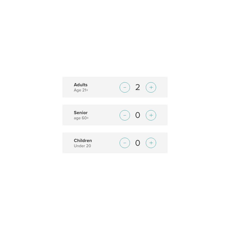
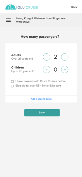
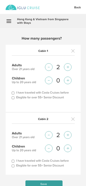
Knowing the age of each passenger is essential to generate a precise quote for a cabin, and that's how we start the cabin selection flow. During the user interviews, we identify a few minor problems in the current design:
In the first iteration of the prototype we solved it using dropdown
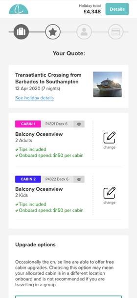
The "senior" field was transformed in a checkbox, where we clearly explain why we are asking for your age (check if you are applicable for senior discount). Here is the final page, that also supports the booking of multiple cabins and a "selected status" that will open the road for future AB tests, where we may completely skip this phase.
Problem 3
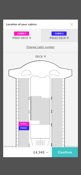
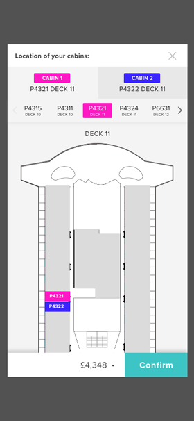
Deciding on a Cabin location is very tricky for users as requires a knowledge of the ship and of the industry terms. In addition to this, many users do not even know what they should look for. For example, we have learned from customers that a Cabin located one floor under a public space is not recommended if you value silence. Cabins at the center of the ship are more recommended if you are seasick, and so are lower decks. Some cabins are far away from elevators while others are too near with a small crowd in front of your door at every hour.
We were presenting customers with an overwhelming choice of 20 available cabins to choose from. This was causing a lot uncertainty and historically we had an high bounce rate at this stage of the process. Our solution of reducing the number by preselecting the best cabin for each group automatically worked well for everyone in terms of user conversions:
Result: Conversions bumped up of 3.5% with the new workflow because we have made 2 steps optional and user interviews we had after this change shown us that the user confidence in their booking is increased.
Booking multiple cabins brought several challenges in the deck plan area, as customers may want different cabin type, but still be near each other. We solved this by automatically assigning the two cabins and discouraging the manual selection of a cabin grade.
We designed a completely new experience that affected many areas of the booking flow, but we A/B tested each assumption separately. The user centric approach paid off and many of the B variations reached confidence level in just a few weeks. Its effect was clearly visible in the data in terms of absolute number of conversions between the two versions. User of the B variant were also spending significantly less time in completing the booking flow and selecting their cabin, and had a lower bounce rate.
The most significant improvement from the redesign came from looking at the current data and UX flow with a critical eye and redesign the whole flow, rather than trying to fix UX problems in each component. It was vital for the success of the operation to decide on the removal and automation of several steps that were causing friction, with no added value for customers, like Cabin grades, asking every customer to select their cabin location in the deck plan, reducing options like cabin type, cabin features and promotion to a minimum and grouping similar options together to simplify the decision.
Some of the problems / solutions touched multiple areas and required permission from different stakeholders like marketing, commercial, sales in order to happen. They were involved during the research phase but after the product team worked independently to create the prototype and we disconnected a little from the other teams. Given the high impact nature of this project, we should have organised regular catch ups with the other stakeholders and not only keep them involved, but also directly ask for their help: many of the biggest challenges we faced were related to data they had direct control over, and they could have drastically improved the user experience if they have decided to come together and reorganise that data for us. The result was that we could not create the ideal UI as we needed to work around the data problem from our side of things, rather than fixing it at the source with the help of other teams.
One of the considerations that emerged during a design sprint was that we should really try to define what kind of brand we are and use it to guide our design in the future.
Are we a "cruise deals" website, or we offer a "service" to our customers that help them find the best cruise for your needs, bringing you all the data you need to take an informed decision?
I am really rooting for the latter, as it will allow us to take a more user centered approach in our design decisions.
This requires more qualitative research on our side and more collaboration between teams, but it's clearly possible as the business has a lot of loyal followers.


I would like to know your thoughts on this case study, please help me do better. Complete the survey and claim your free Candy bag. Average completion time is 3 minutes.
Start the survey
 About me
 Works
Works Contact