
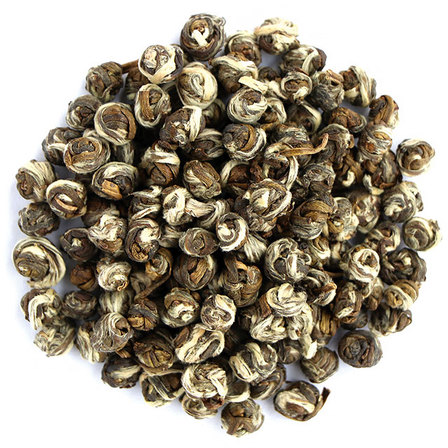
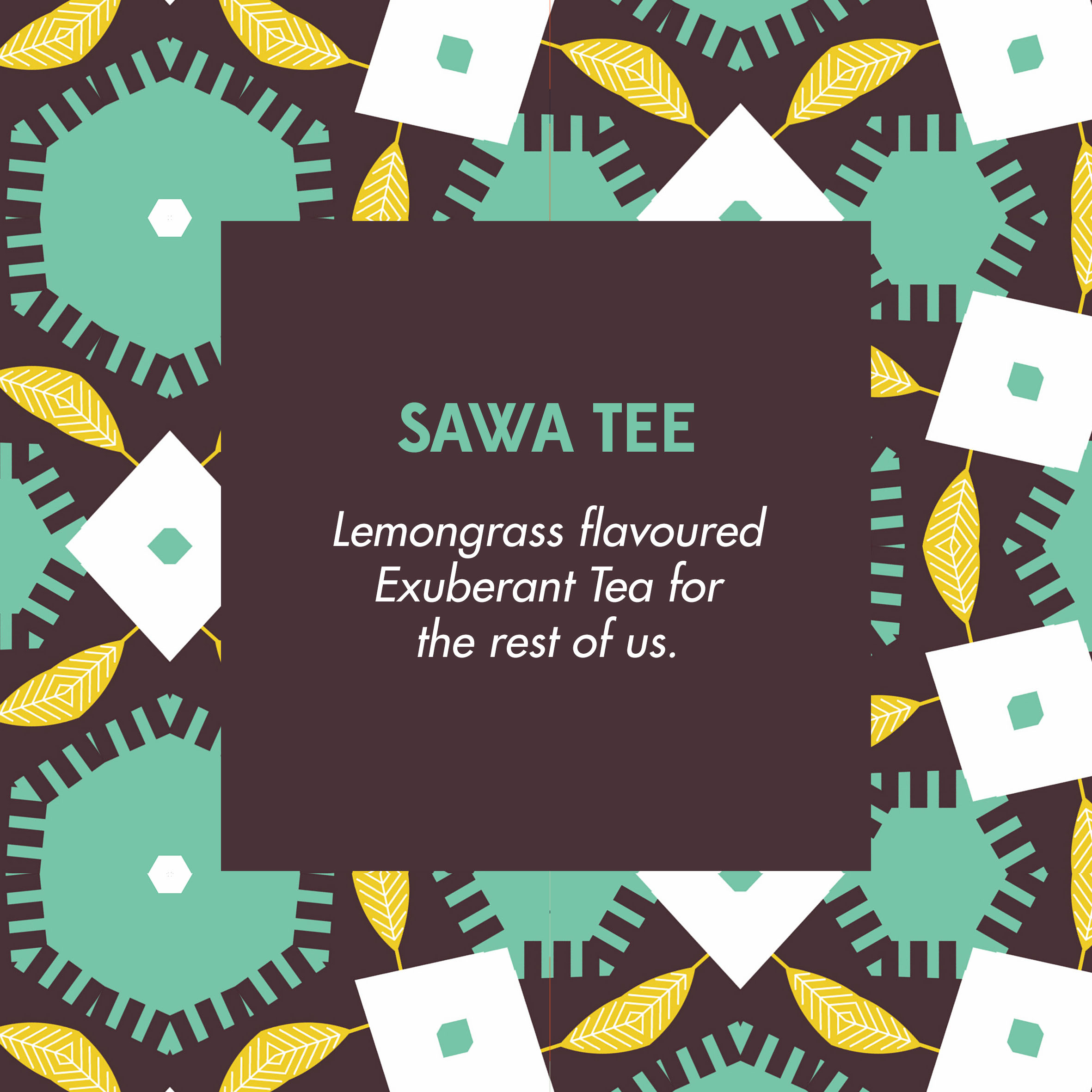
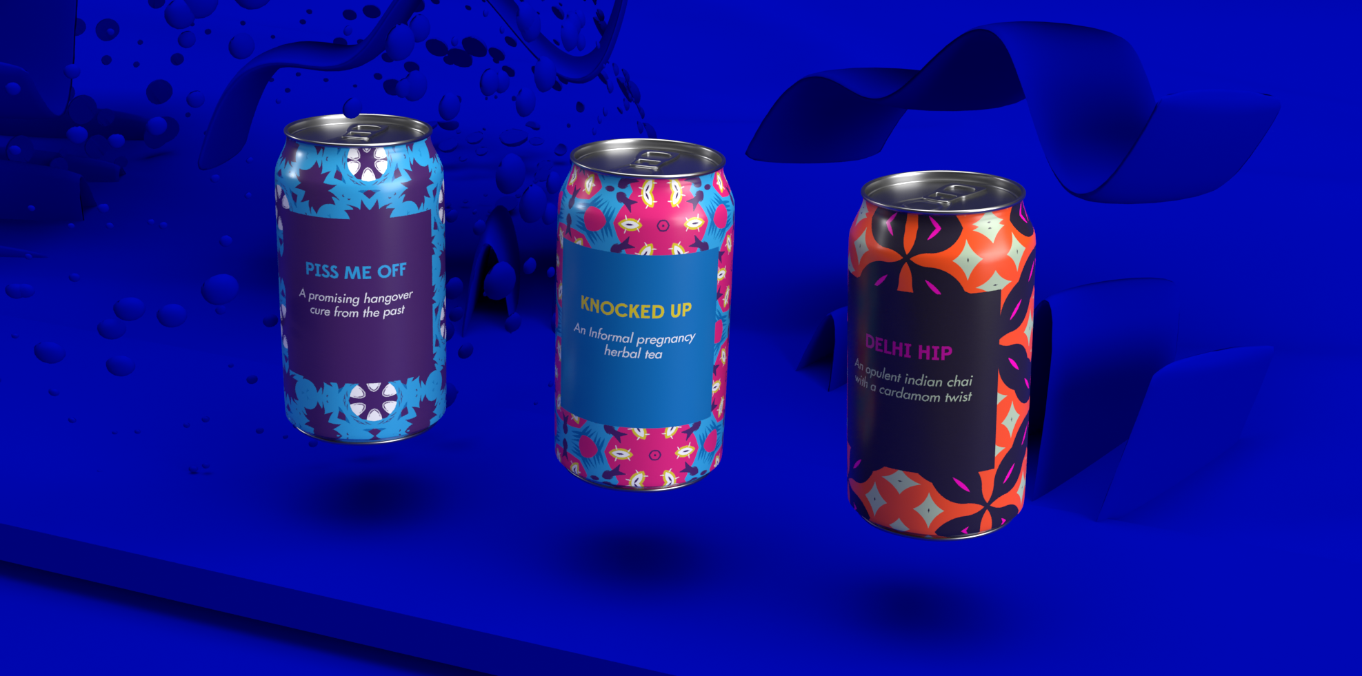
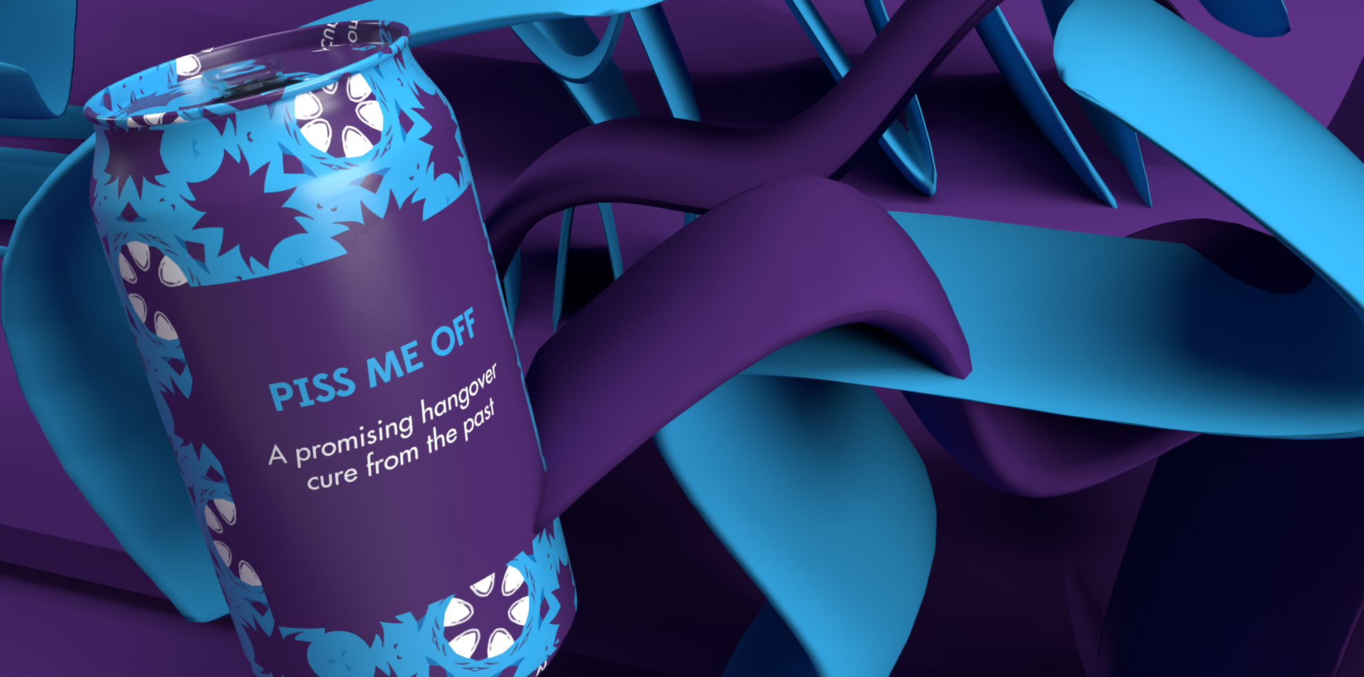
One of the best applications for my pattern craziness was to use them in this flexible brand identity for Teapotters UK. These stunning boxes ( if I do say so myself ) contain very tasty herbal tea infusions that you should absolutely try.
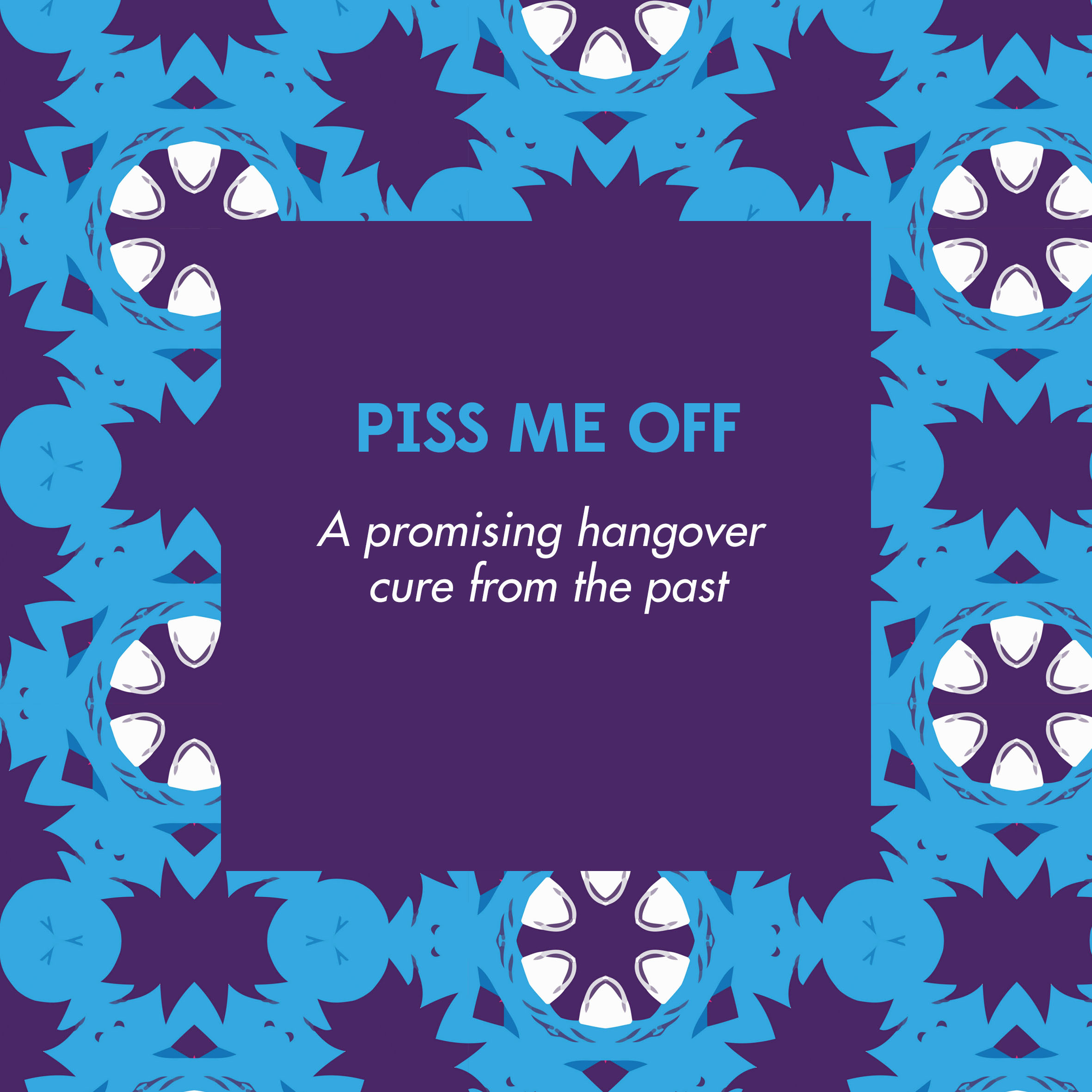
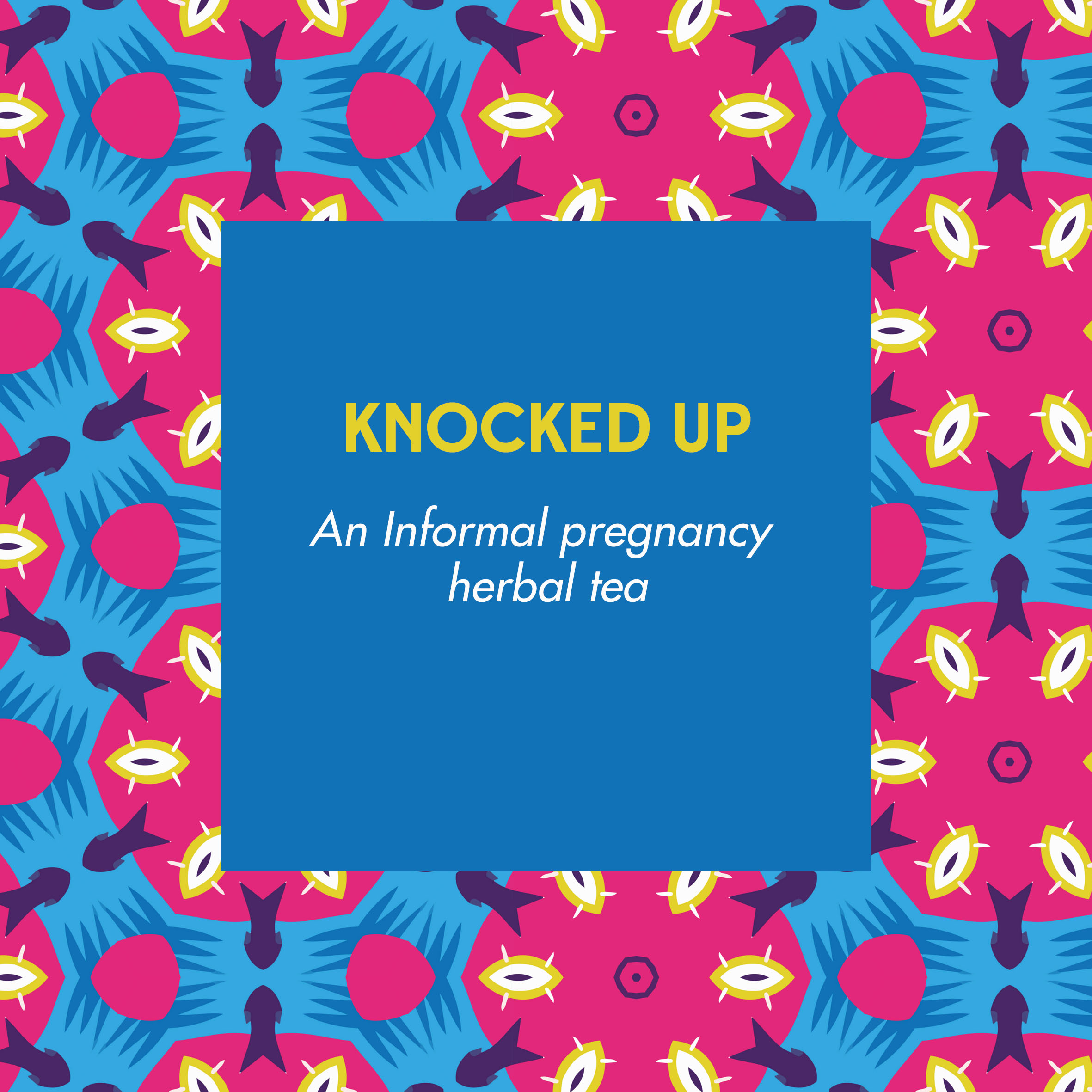

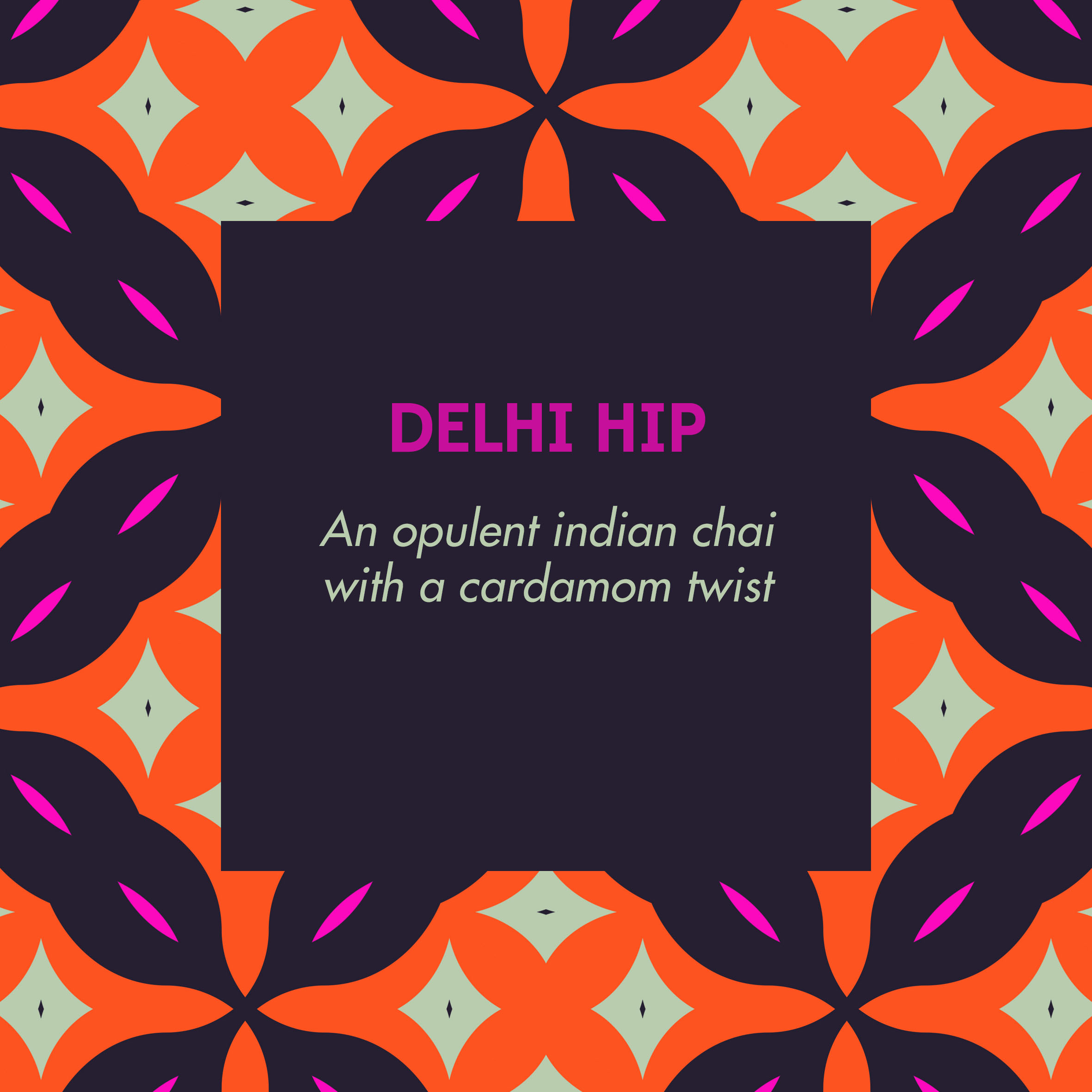
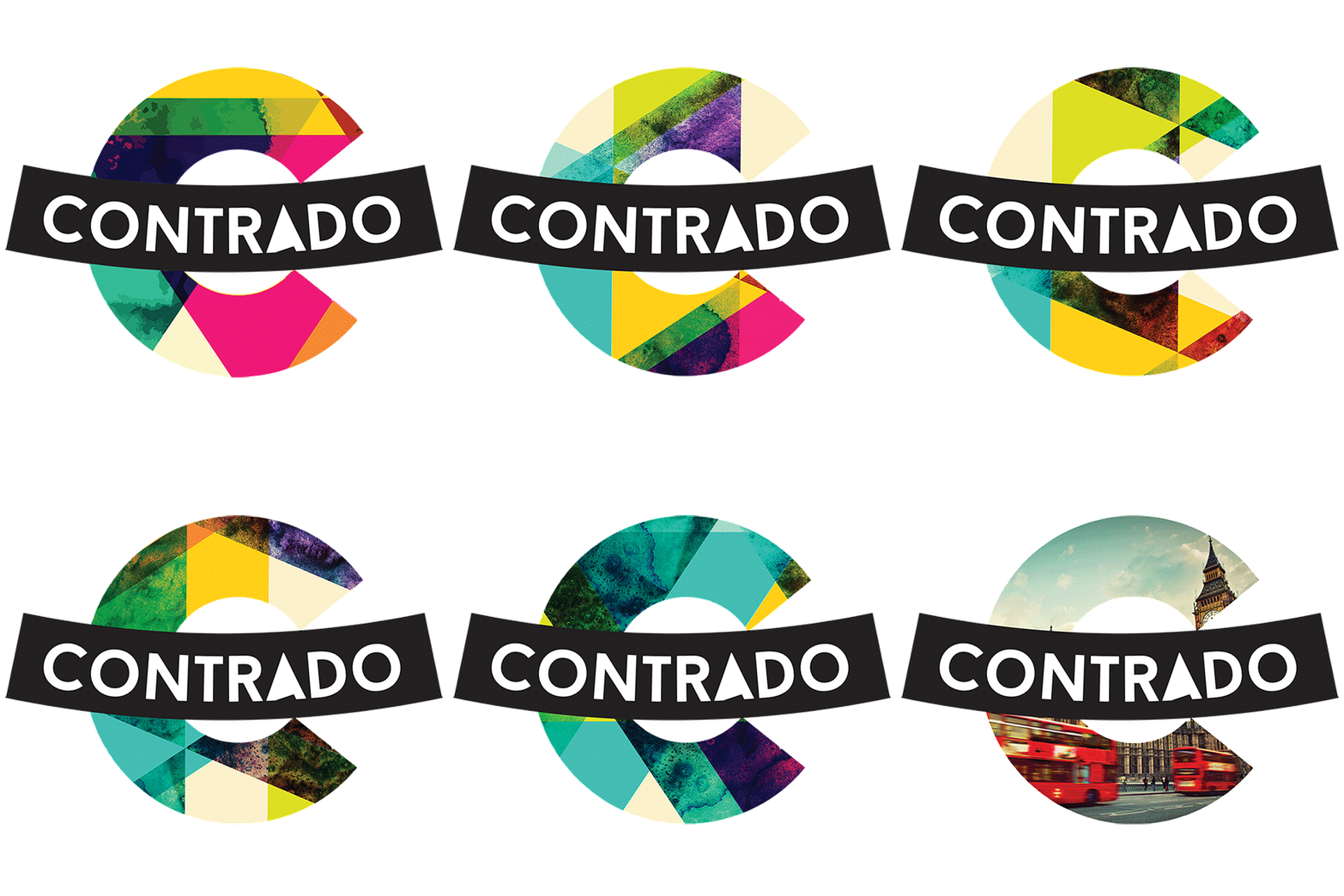
The old Contrado Logo ( made in 2014 ), was associated with a flexible brand identity, where the "c" shape of the logo was filled with a series of patterns specially designed, with different colours and shades. This was made to create a similarity with our printing technology that was allowing for bold colours, shades and huge tonal range.
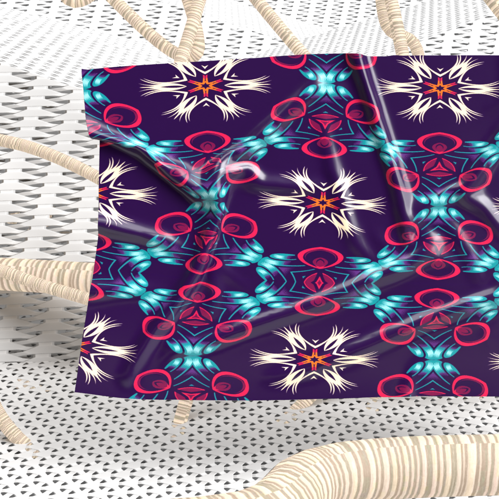
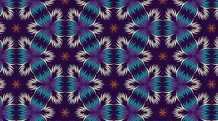
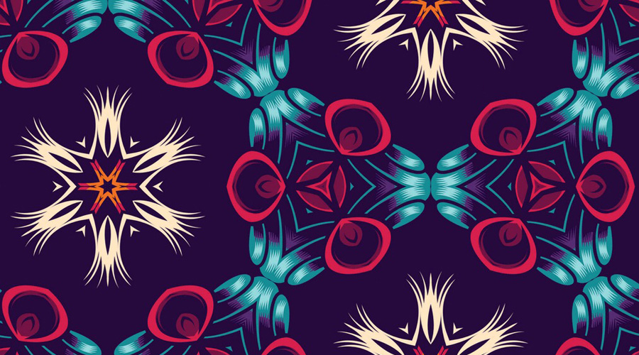
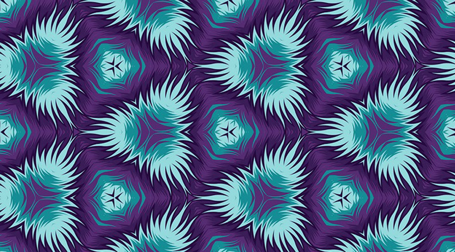
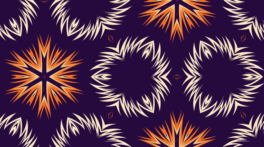
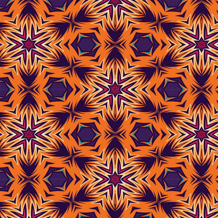
Purple is the colour typically associated to women, and I loved how well it works against more classic African colours like orange and red.I have created this collection specifically to pitch my work to a textile company specialised in African pattern.



I would like to know your thoughts on this case study, please help me do better. Complete the survey and claim your free Candy bag. Average completion time is 3 minutes.
Start the survey