I owned the research, UX, UI and HTML / SCSS / JS work for this project, working in pair with my co founder, John Grant, who integrated with the blockchain and created the backend for the project.
Luca Guglielmi (founder)
John Grant (founder)
When I started, I did not know exactly what to build. I know I wanted to fiddle around the concept of "the future of work": my inspiration were the no-code movement, Decentralized Autonomous Organizations (DAO), gig economy, indy hackers and the small communities that pay bounties for open source work.
Rather than looking for a specific problem, I have decided to look for a specific kind of user and interview them. I have approached people with entrepreneurial mindset through very specific channels. Makers, developers, designers, marketers. I told them about my research, listened to their stories and just informally chatted over different ranges of topics.
"It's hard to find fellow makers to build stuff with" This came up several times during my interviews from different sources.
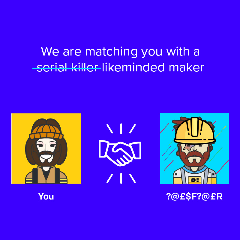
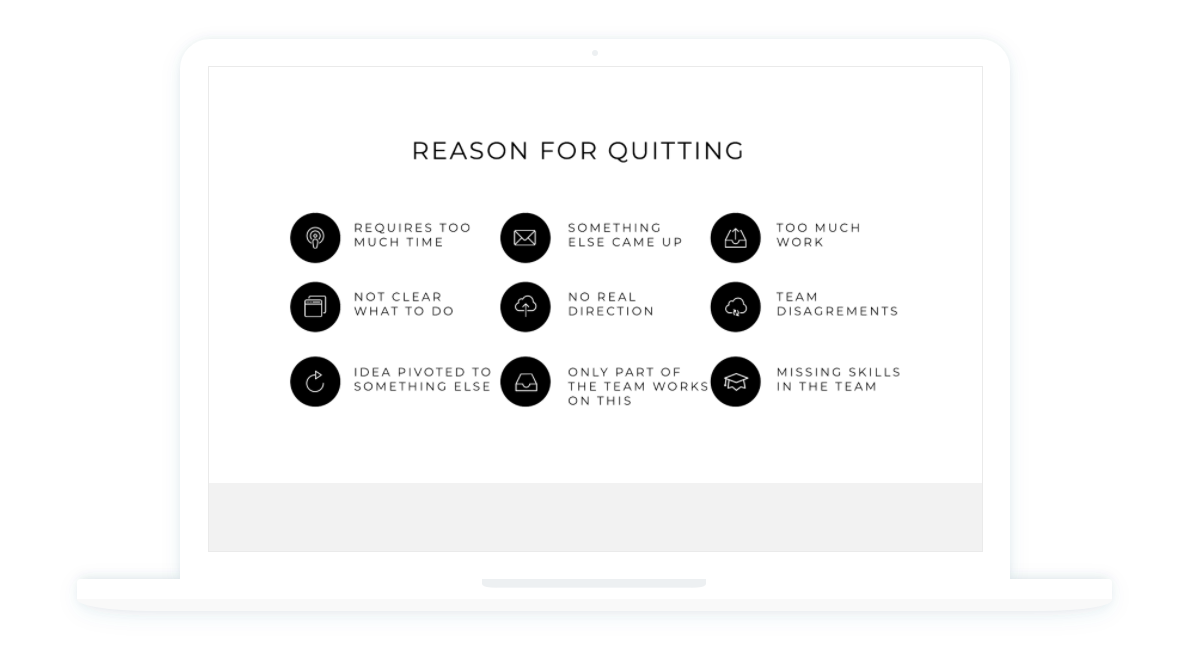
Difficulties in finding a co-founder was clearly one of the main concerns of the people I interviewed. This wasn't exactly what I expected to find out. I knew there were a few websites and communities that already try, directly or indirectly, to solve this problem but nothing really did stand out to me, and decided to narrow my research on this specific problem. I have directed the second stage of my research around people that were currently seeking co-founder or they have joined forces in the past with 1 or more individuals.
I specifically looked into several channels connected to cryptocurrency hackathons, which I believe is a thriving ecosystem of very skilled and highly motivated individuals with an entrepreneurial mindset.
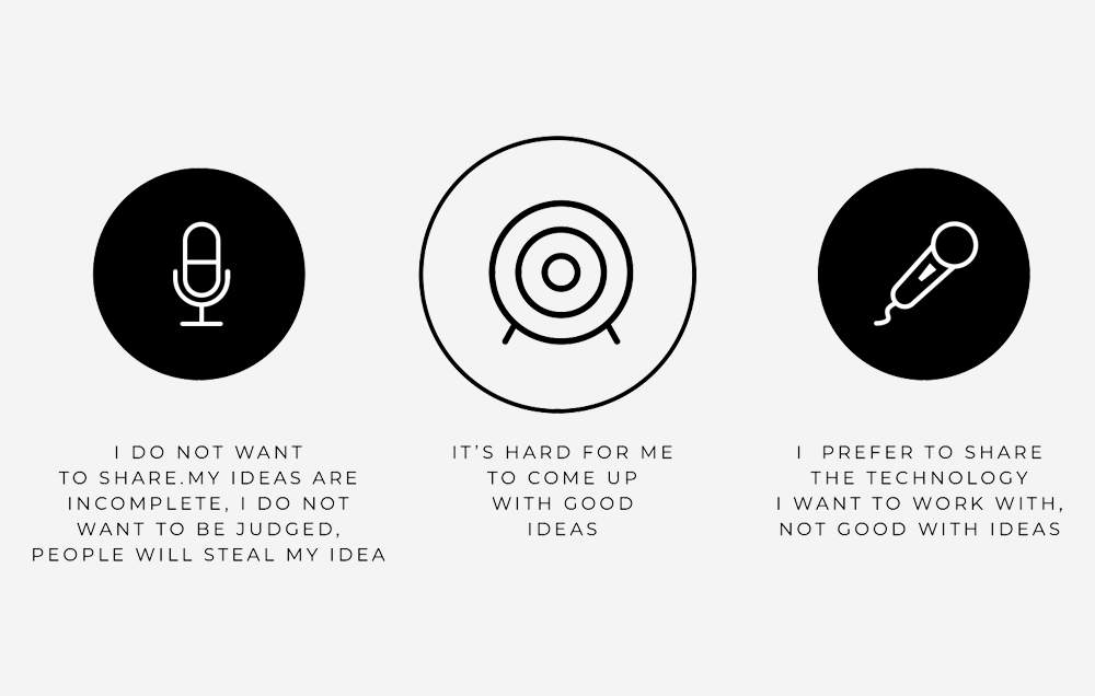
Many people are willing to join a team when an idea is already formed but are not very keen in proposing ideas in a public way and try to build a team around it.
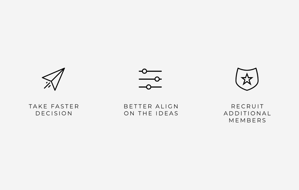
This was a constant in the successful stories that I have interviewed. All it takes is a "core team"with very few component and agile decision making... they will get the idea started and create the necessary condition for other people to join and bring their contribution.

Many teams complained about lack of commitment during Hackathons from users that initially demonstrate interest but they do not actively worked towards the set goals and just disappear after a while.
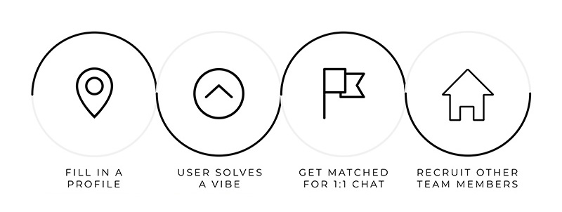
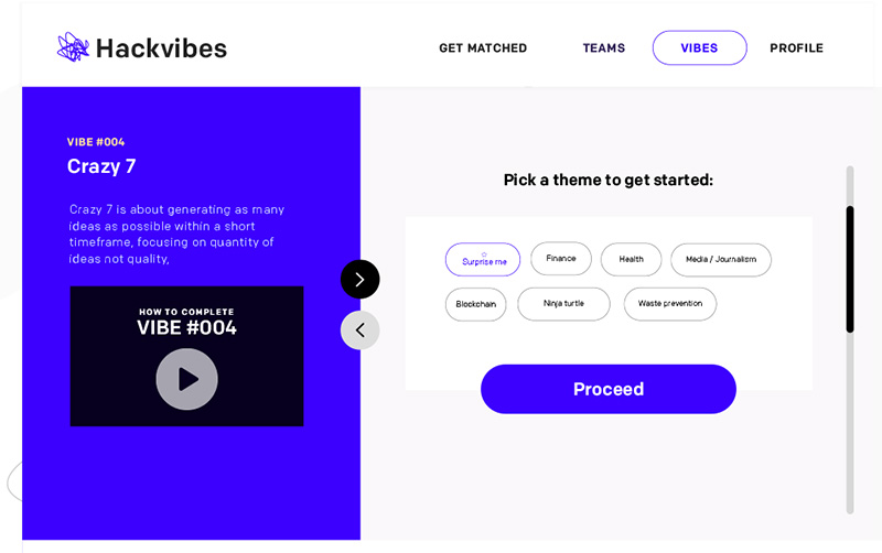
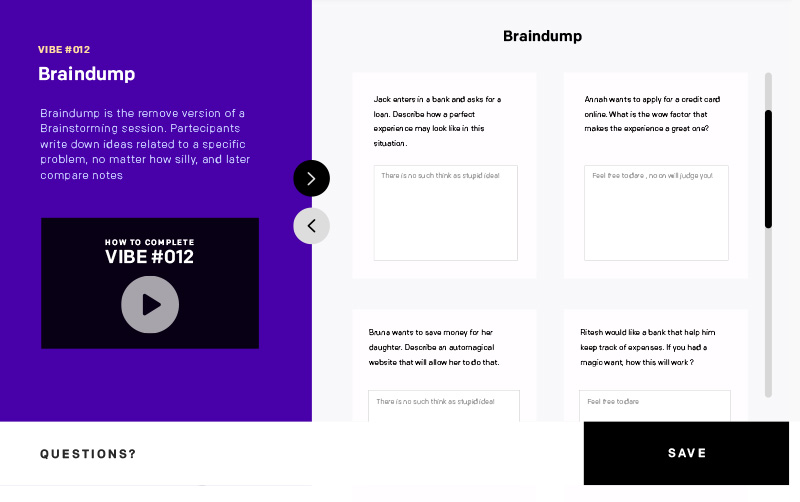
Hackvibes started as a quirky MVP that matches wannabe entrepreneurs with like minded makers of complementary skills for a one to one chat. This match happens through online design thinking exercises that you can take in our platform - we call them "vibes". These are classic brainstorming exercises about a specific topic. For each resolved vibes, users will get a match with a like minded maker who also completed the vibe, and a chat channel will be opened with that person.

Vibes exist for 3 reasons, all connected to the problems I have identified during my research: Help brainstorm ideas before matching with a potential collaborator. Expose users to design thinking methodologies and facilitate the generation of original ideas. Proof of commitment ( completing the exercise requires effort and the reward is your match with a like minded maker )
The marketing website had to be part of the MVP, as I wanted to explain to my users how the app worked and what they could do with it. I only had a few days to launch the marketing website before the submission to the Klaytn Horizon hackathon, as the web app was taking all my time, but I did focus on animated interactions and other small details to make the site look more polished.Happy to discuss about my approach to the Hackvibes brand identity and how I have planned my site based on what I knew about my target audience . Ask me about it!
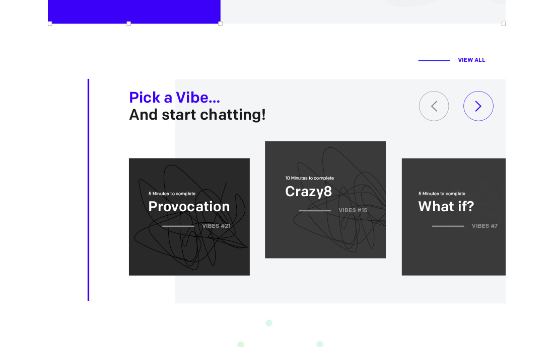
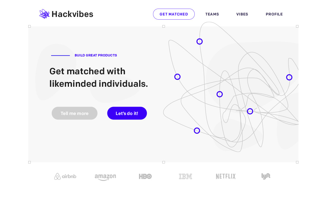
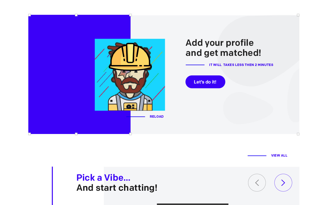
The web app was the true core of the MVP, where the user went through different steps in order to get a match. The biggest challenge was to validate the concept without building every single functionality we needed. Some goal I have considered:- Explain the users how it works, and see if they take action or leave the site. This was done through a guided onboarding and supported by an intro video for each vibe.- See how users solve the vibes, and what problems they bump into.- Compare how the app works, and how it differs from user expectation- See if users engage with their match- See if the users are willing to complete multiple design thinking exercises to get multiple matches.

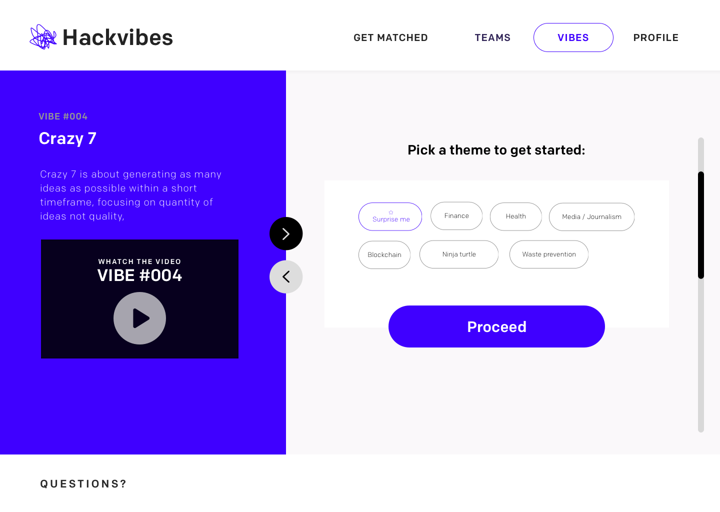
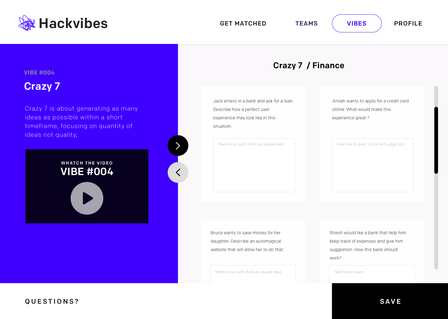
According to our feedback after launch, many users completed a vibe, got a match and never come back to chat with the person they were matched with. Every time a user did not engage, he was dragging his match with them, and we would lose not one but two users. We did not have a backup plan in the system for users that got stranded by their match.
We identified the problem in the MVP, it was too scrappy, we were relying on our users to connect to a third party chat, where we did not have any oversight to see what was happening.I reacted to this problem with the following actions, aimed at learning more about the problem rather than blindly fix what we thought was wrong:

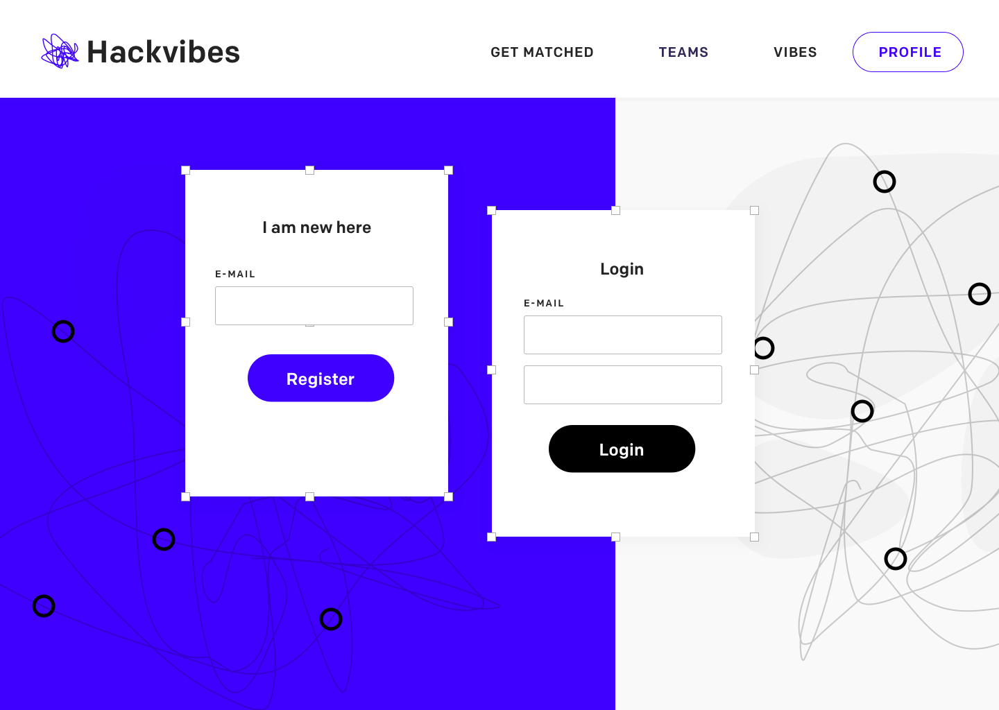
I generally advocate against creating a sign up wall for users, but in this case it was vital for us to store the E-mail of each user and be able to re-engage with them in case they got stranded by their match.
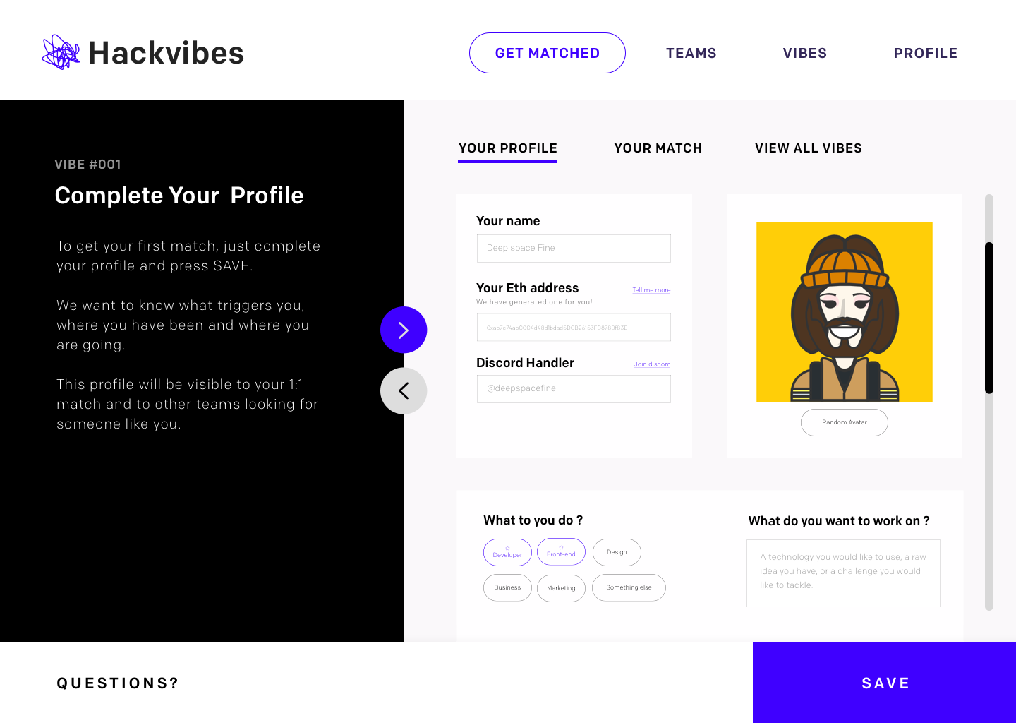
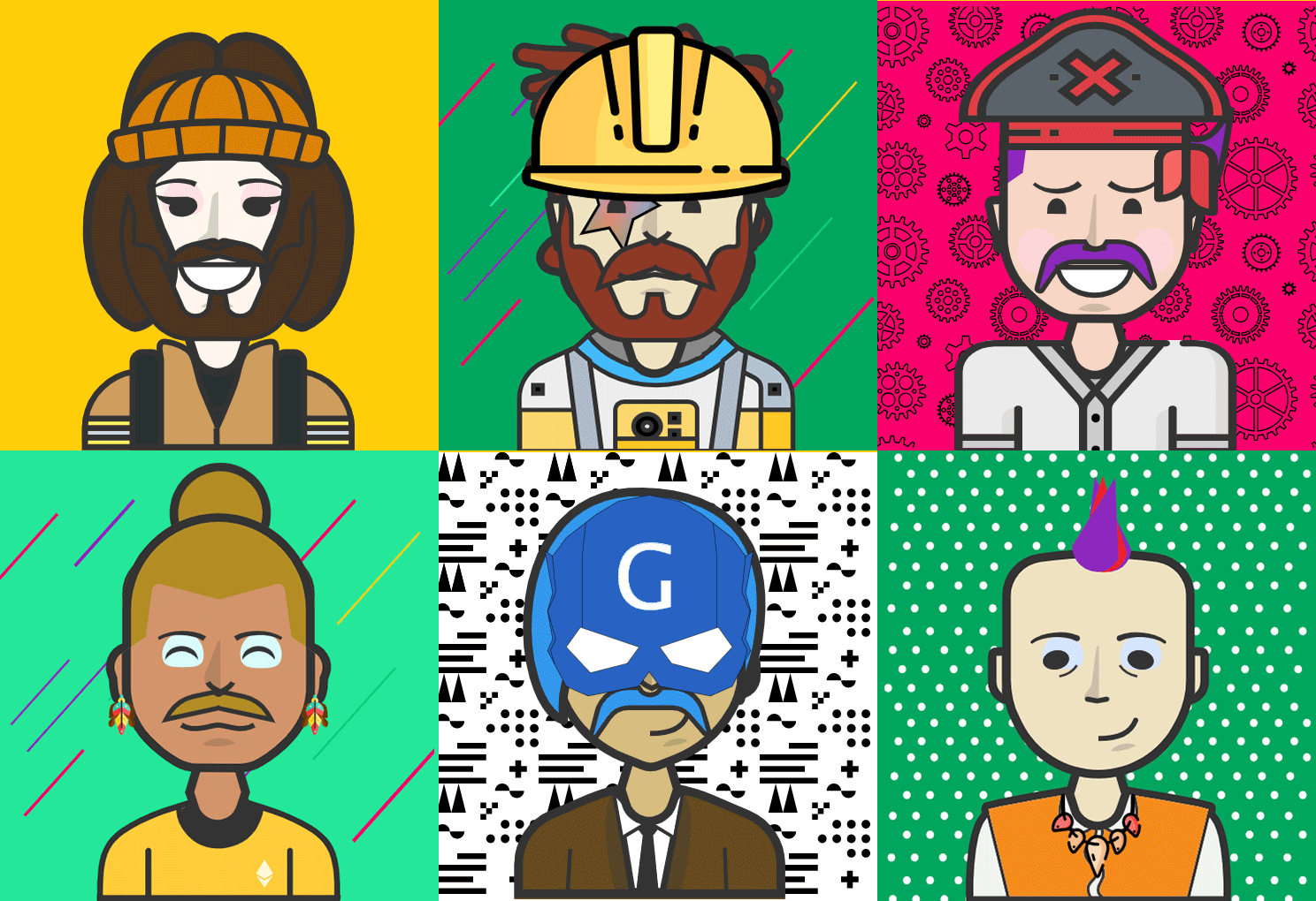
As it was now a mandatory step, we tried to make the sign-up process more appealing to users, this was the first interaction the user had with the app and we really wanted it to feel good.We added some funky customer avatar images ( open source ) and other multiple closed answer questions to help with the matching algorithm and give a sense of what's coming next, all mixed up with some nice animations and cheeky copywriting style.

Many users would only interact with one single vibe and get one match. So we changed the rules a little, and completing the sign-up wall was now considered as completing "your first vibe". This will give you an immediate match with another maker for a one to one chat.We were delighted to notice that after this change many user would complete a vibe anyway, having in fact two different matches: 1 for the sign up, and 1 for the complete vibes.The chance of getting "hooked" were much higher now, and we saw people completing even 5-6 vibes after the initial sign-up.
During the third cycle of iteration of our prototype, "lack of commitment" was mitigated but was still an issue. This was a significant weakness for our MVP: if the first match was with a non-engaged user, the whole user experience would feel like a huge loss of time and we would lose 2 users just because one of them wasn't interested.We needed a solution and we brainstormed our way into what in Hackvibes is called "proof of commitment". But we are still looking for a better name.

Proof of commitment in hackvibes delivers higher commitment rates between users that want to match, almost 100% actually if you only look at that KPI! This is because their money are at stake if they do not interact with their match.
If the user is very committed in matching to a maker, he could decide to stake a small amount of cryptocurrency in a smart contract deployed by hackvibes.This user is now "verified" and it will only be matched with other verified users like him. They will complete a vibe and get matched as usual, and if they chat together their money will be released. The whole experience will not cost anything if they interact with their match, while if they did not engage, they will not be able to retrieve their money.
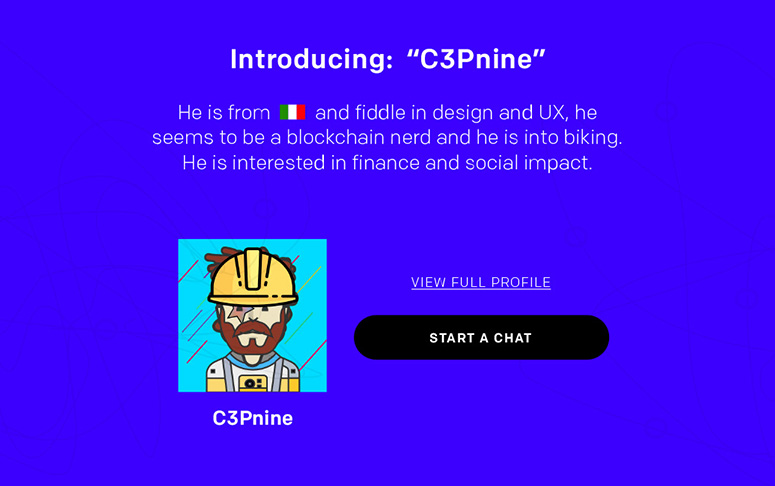
For every completed vibes you meet a new maker. Using the website, is an effortless way to develop a network of individuals that can pitch you ideas for collaboration, or bring support and feedback to any of your projects.We see Hackvibes V3 to be more community driven, with public vibes and even sponsored challenges, where the user can actually earn cryptocurrencies by teaming up with other makers to resolve them.
Some users were completing the vibes but then did not interact with their match in any way. We resolved this by adopting the concept of "proof of commitment". Essentially, we request a symbolic payment for every completed vibe. We securely hold the money until the user interacts with the maker he has been matched to. When this happened, the money are released back to the owner.If the user does not interact with his match, the money remains locked by us until something changes.This is done though cryptocurrencies of course. Are you wondering why? I will be happy to talk for hours about this topic, Just ask me about it!
The first version of the MVP was running "manually", with me actually matching users between them and connect them through a discord server for a chat.The initial interest was pretty good and I interviewed my early adopters to get feedback on the MVP ( most of them were my friends anyway). Some users never contacted their match after completing the vibes and it was very hard to rematch them as everything was managed manually. Vibes were very well received but many felt the potential was untapped as there were only a limited number of them and some of them weren't 100% clear. This one was on me, as I have focused more on the delivery than the actual quality of the vibes. Users actively requested to see other user's vibes. This was interesting as there was the potential of a database full of brainstorming goodness, as long as the users agreed to share their thoughts.
Overall this project was a lot of fun and I am very interested to see where it will go during the next iteration. A few takeaways so far:
I built something completely different
I ended up building something completely different - and probably not as mainstream - of what I had in mind when I started. This is not necessarily negative, it was fun to follow a true user centric approach and not having any kind of business needs to consider for once.
The first MVP was "too lovable" and not as "Viable"
as I was hopingI was proudly building a MLP (as in "Minimum Lovable Prototype") and spent days perfecting interactions, animations and other delightful experience while overlooking the very core of the product: the design thinking exercises.After a few iterations, most of these animations where not needed anymore because the flow changed after the initial user feedback, and I realised I should have used that time in perfecting the core area of the MVP, and generate better content for our "vibes" instead.
Too much blockchain optimism!
We knew that integrating blockchain logic into the product wasn't for everyone, as it would require familiarity with the blockchain ecosystem. We tried to make this as seamless as possible and hide the blockchain functionality "under the hood". However, we were forced to be quite scrappy at this, because of technical limitations of the MVP, and definitely the use of a blockchain caused some obstacle in user adoption. In future I would probably try to support two separate workflows for this, so that it does not ruin the experience for the less technical users.


I would like to know your thoughts on this case study, please help me do better. Complete the survey and claim your free Candy bag. Average completion time is 3 minutes.
Start the survey